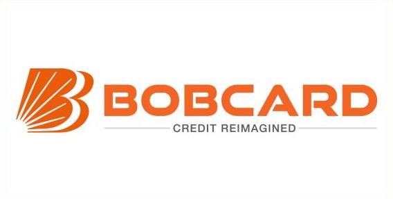
Bank of Baroda’s wholly owned subsidiary, BOB Financial Solutions Limited (BFSL), announced a rebranding on Tuesday, transforming itself into BOBCARD Limited. The company introduced a new logo along with the positioning statement “Credit Reimagined.” According to a press release, the rebranding signifies a renewed commitment to reshape the credit landscape in the country, offering excellent credit solutions with a customer-centric approach.
The new brand promise, “Credit Reimagined,” reflects the company’s dedication to providing customer-centric, solution-driven assistance through innovation. The rebranding is more than just a visual transformation; it represents a revitalized commitment to meeting the evolving needs and preferences of individuals across the country.
Shailendra Singh, MD & CEO of BOBCARD Limited, expressed excitement about the brand’s new journey, stating, “Today marks a pivotal moment in our journey as we unveil our refreshed brand identity.” He emphasized that the strategic rebranding positions BOBCARD as a forward-thinking financial partner, committed to elevating financial experiences and empowering the community.
The new BOBCARD logo features dual ‘B’ letterforms holding the rays of the rising sun, known as Baroda Sun. The sun is chosen as a symbol of powerful light and energy, representing BOBCARD’s aim to be a source of light for stakeholders, customers, and employees. The logo, adopted from its parent brand Bank of Baroda (BoB), reflects the brand’s legacy and ethos. The single-color vermillion palette chosen for the design complements the representation of hope and energy, balancing tradition with a progressive outlook.
In summary, BOBCARD’s rebranding signifies a commitment to adapting to new business paradigms globally while staying connected to its heritage, symbolized by a logo that represents dynamism and optimism.


